Kant – a serif companion to Polo
We are delighted to introduce Kant, a new addition to our Georg Salden Library.
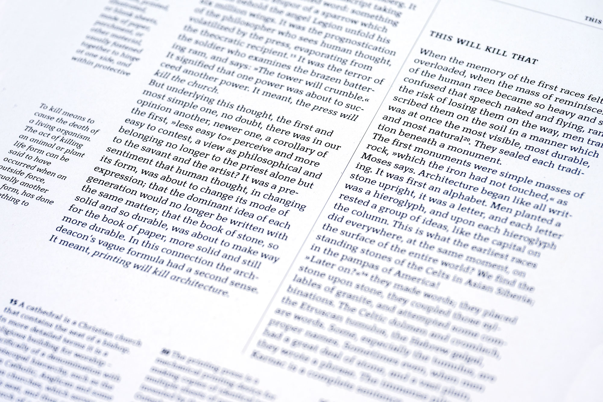
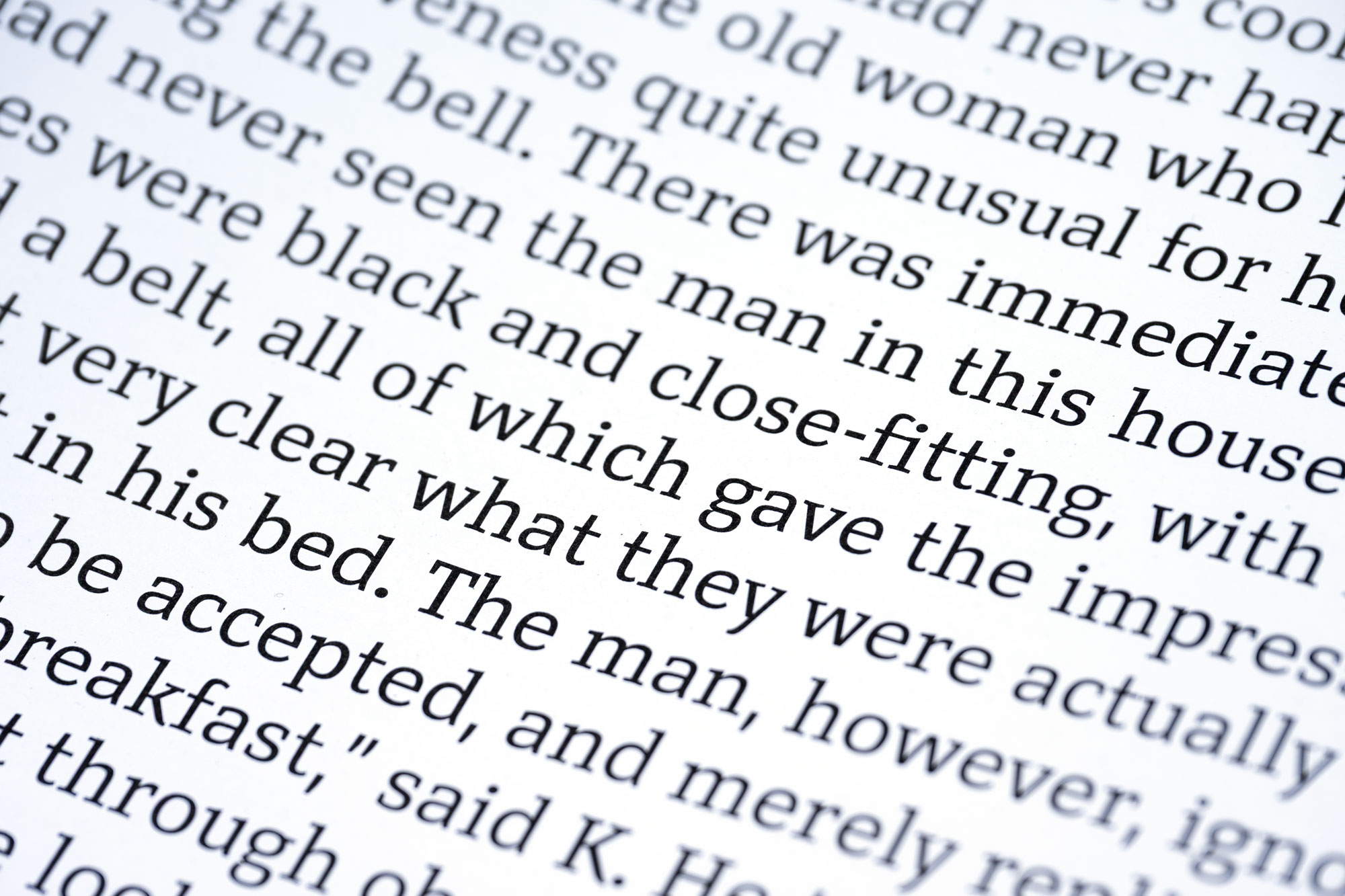
Kant is a humanist serif with both feet on the ground. Georg Salden originally drew it as a companion to Polo, his pioneering humanist sans. The two share a common skeleton and many of their most characteristic letters, yet Kant takes its own path wherever the logic of a serif calls for it. The result is a practical and direct typeface with a distinct character of its own. Designed for reading, Kant has the reliability of a workhorse without feeling generic. There is a certain physicality to its forms, something crafted and deliberate, that becomes especially visible as the type gets larger. It can feel equally at home in a book, a newspaper, an identity or a sign.
At the heart of Kant is a simple idea: clarity does not require anonymity. Compact forms, pronounced serifs and moderate stroke contrast give the typeface a firm, even texture. Kant is clear and confident, with a strong presence at large sizes and the openness and definition needed for good readability at small sizes. Its forms are distinctive without being decorative. This balance between clarity, presence and character defines the typeface.
The family comes in five weights, each with a matching italic. The italic is a typeface in its own right, with calligraphic touches here and there. Kant includes true small caps, several sets of figures and stylistic alternates, and supports an extended Latin character set as well as Cyrillic and Greek.
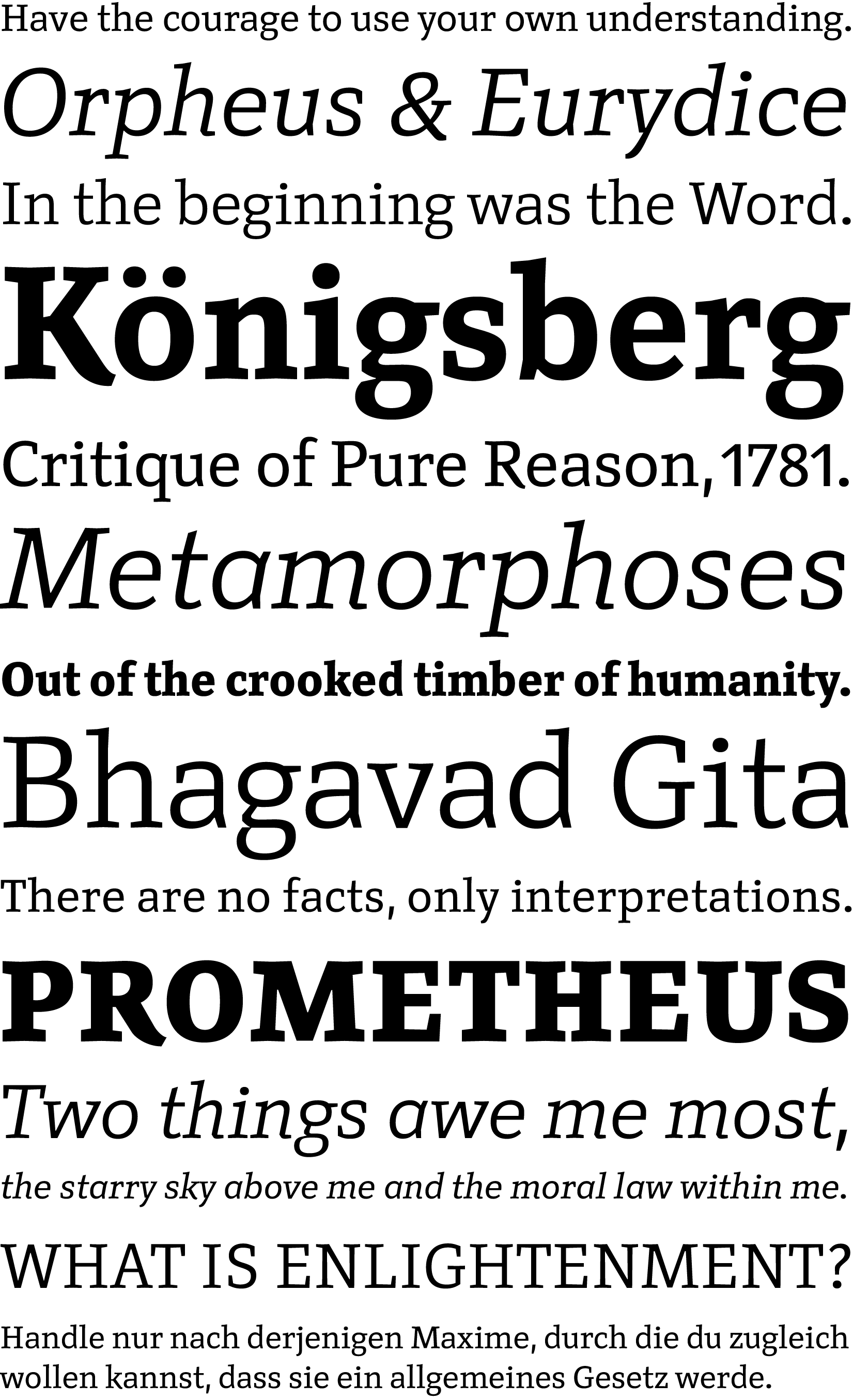
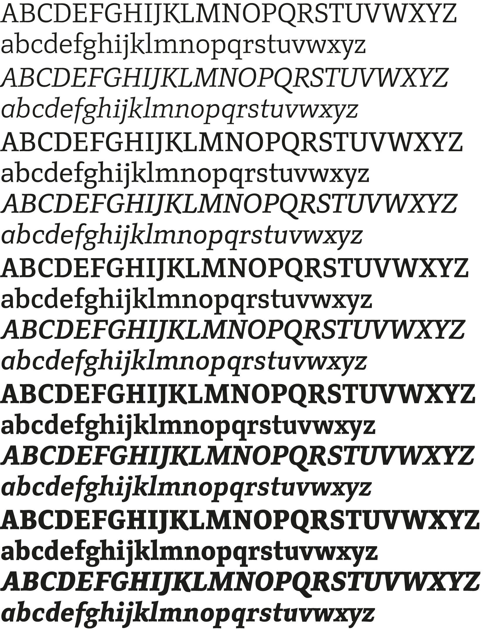
Kant comes in five weights, each with a matching italic. The upright styles include true small caps, and all styles offer several sets of figures, stylistic alternates and other OpenType features for refined typography.
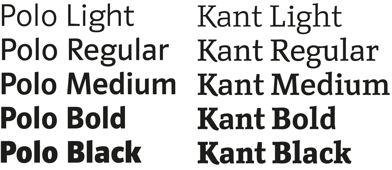
Polo is getting company. Polo is Georg Salden’s pioneering sans serif and his most popular and influential typeface. Kant is its serif counterpart: drawn from the same structure, but thought through as a serif from the start. Together, they can take on different typographic roles, from headlines to long reading, while retaining a clear family resemblance.
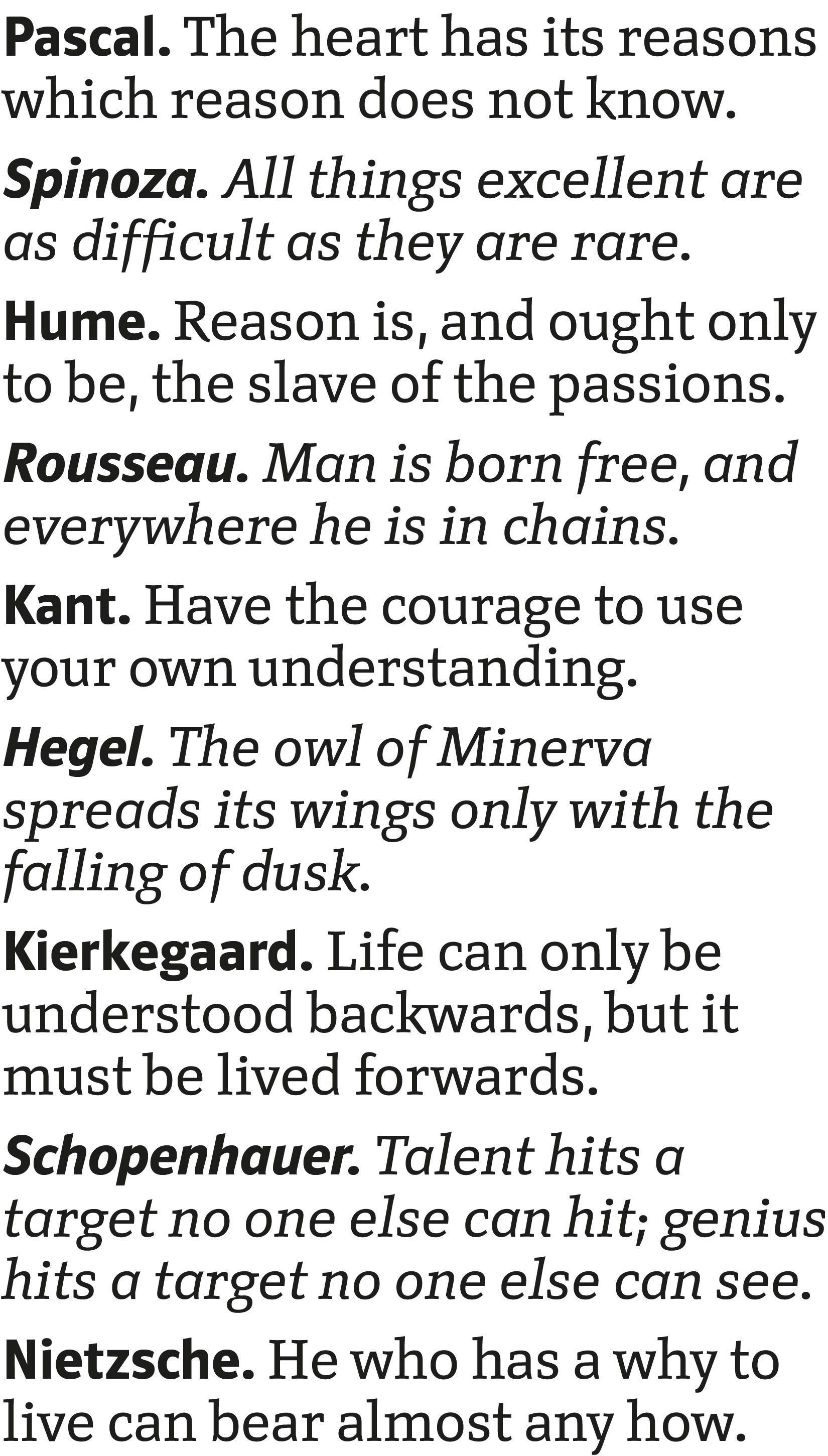
Polo Bold and Bold Italic with Kant Regular and Italic.
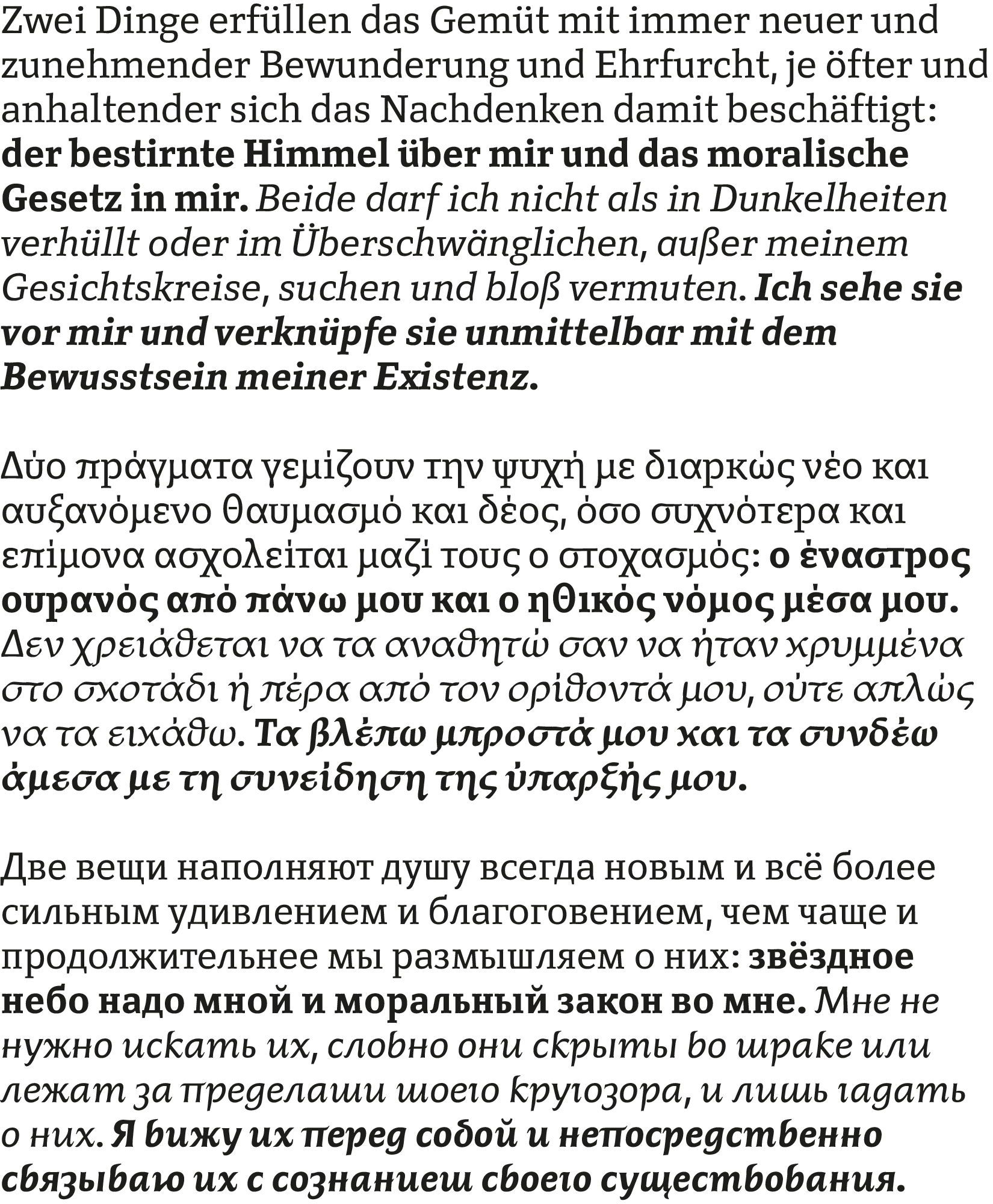
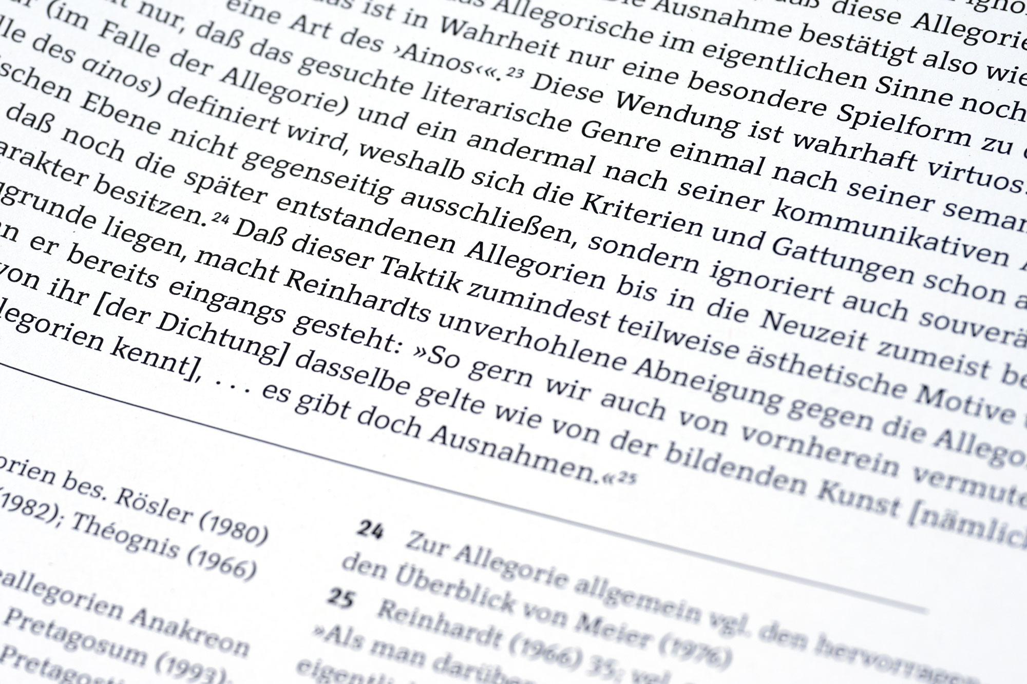
Alongside an extensive Latin character set covering all major languages, Kant also includes Greek and Cyrillic. Each script follows its own formal traditions. In the Latin italic, calligraphic elements appear selectively, for example in letters such as A, E, f and z. The Greek and Cyrillic italics take this much further: their entire structure is more strongly shaped by the movement and construction of handwriting.